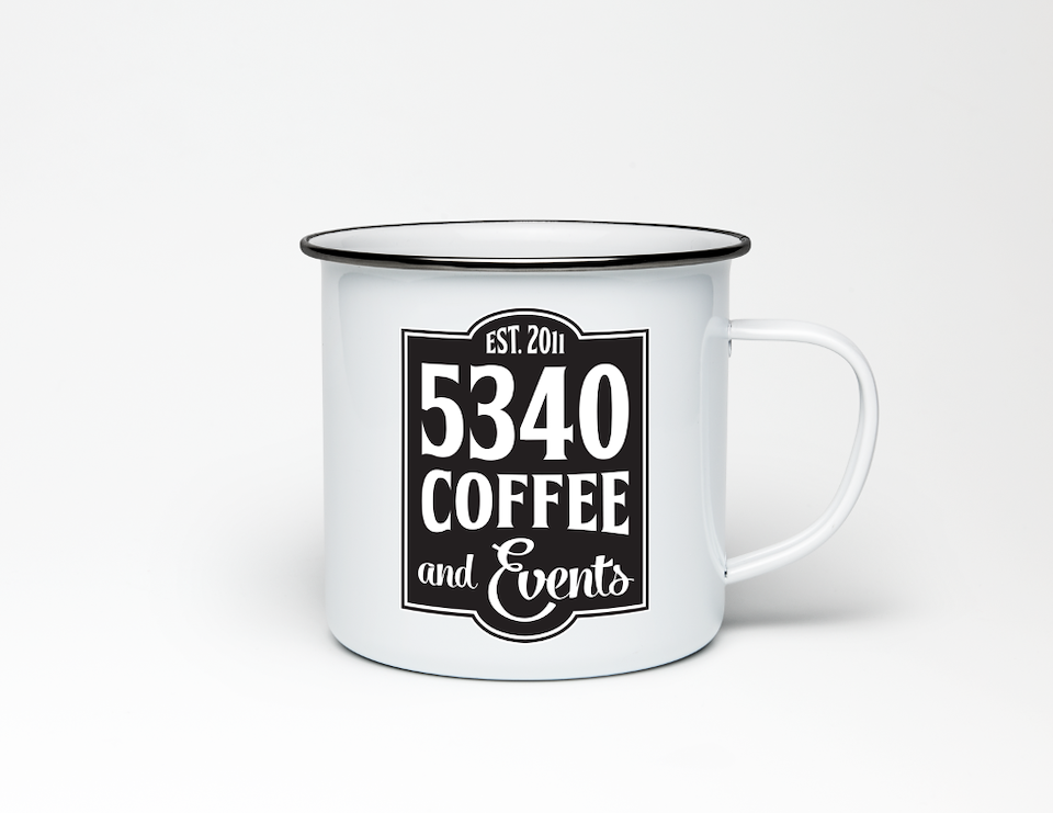
After changing their name from 40 Weight Coffee, the new logo needed to include an important part of their identity (events) and have a similar feel to their previous logo. The logo remained type-based in black and white with a vertically oriented rectangular shape, but new typefaces were used.
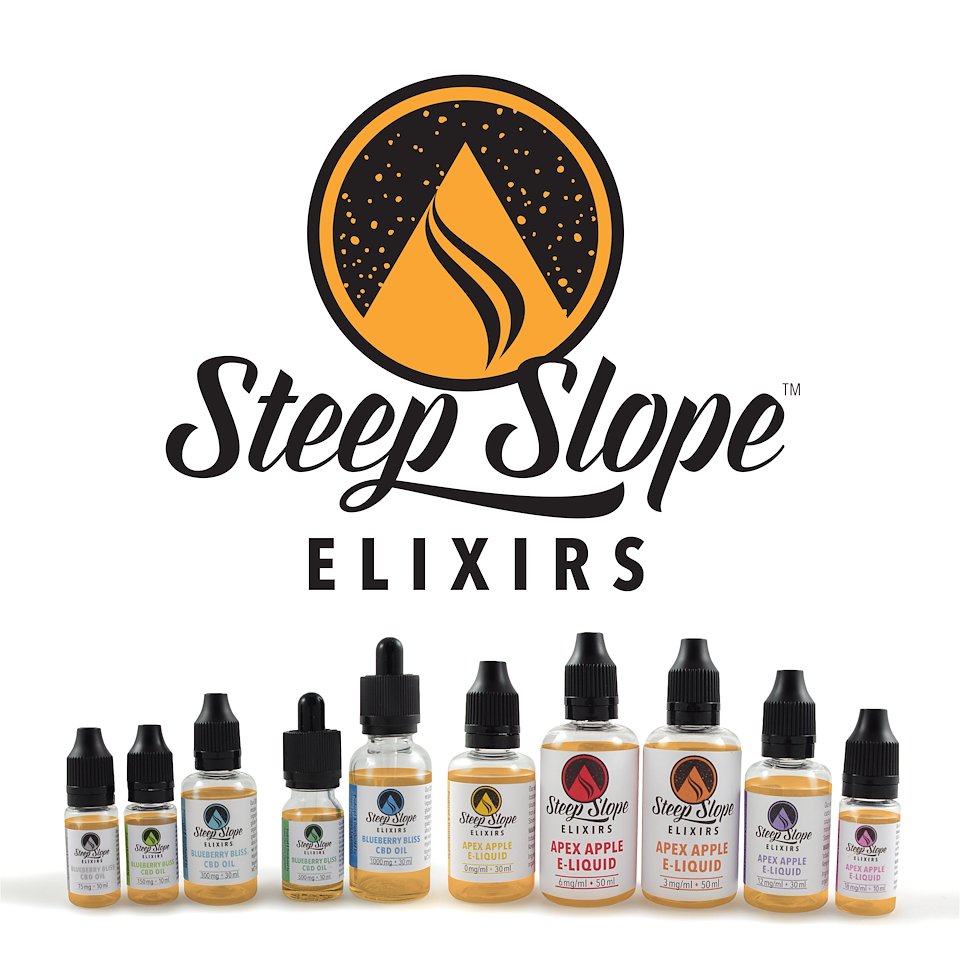
GEC needed a fresh new name, logo and label design for their line of organic CBD oils and eliquids. The goal was to fit in with Colorado’s mountain and ski culture, but to not rely on common mountain imagery. For the packaging, the logo color varies to represent the product’s strength.
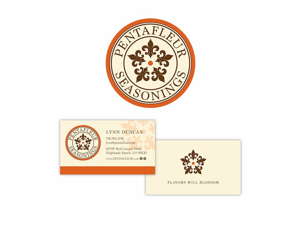
The logo for Pentafleur, French for 5 flowers, represents the warm and floral notes in their spices.
Brand strategy and project management by BrandWerks.
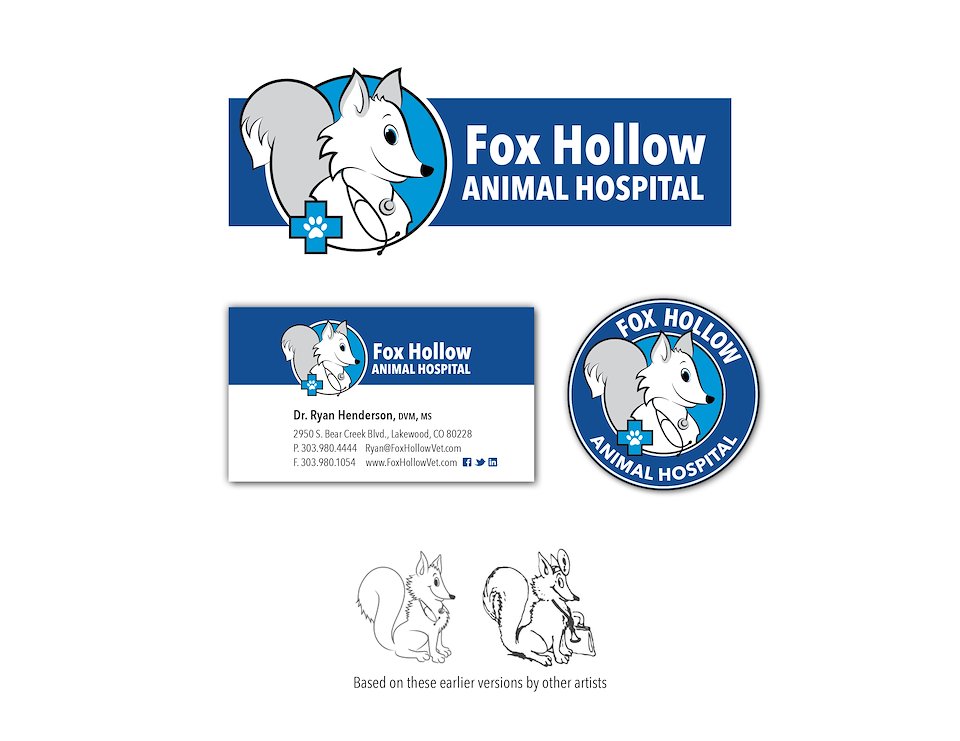
Giving a fresh, clean and simplified look to a cartoon sketch that had served as a logo for many years.
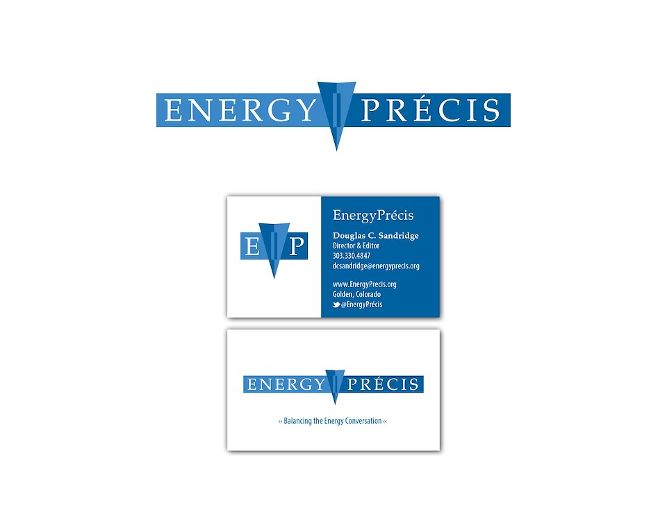
“Balancing the energy conversation” is conveyed through this logo for a public speaker.
A condensed icon was also created to build recognition on social media.
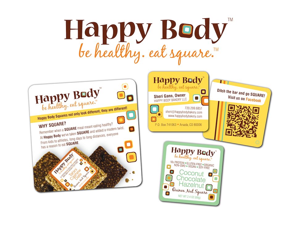
The unique shape of Happy Body snack squares inspired the effervescence and energy of this brand.
Brand strategy and art direction by BrandWerks.